Tuesday, 5 November 2013

camouflage

Here I painted the hand of the same character as previously in tomatoes so that it matched up with a drawn background, so that it camouflaged in quite well.

This is the same painting only taken as a whole against a white background so that you can clearly see the design in itself, making it appear almost like a glove being worn.

A portrayal of character

This is a face painting I did on a character reflecting their likes and dislikes when it comes to food. On the left you have their most hated food; tomatoes, and on the right their most loved; bacon and egg sandwiches. An aspect of real character has been displayed by the use of glasses being worn, so give this image some reality.


Thursday, 10 October 2013

Likes and dislikes painted across a character's face

I painted this character's face with a combination of his most favourite food, bacon and egg sandwiches, and the food that he hates the most, tomatoes. This portrays both his likes and his dislikes next to each other. This is like a small scale snippet of his personality plastered across his face for the world to see.
 
I'm really pleased with this, except for the bacon and egg sandwich aspect. Without me saying it's bacon and egg sandwiches you would never know it's bacon and egg sandwiches. To improve this I will try separating the sandwich elements apart, and then paint it back on from a birds eye view, so you can clearly see the different elements.


Models: Elisa, Lari. This is a really bold, strong image, which is emphasised by the black and white quality of the photograph.

Taking inspiration from Johannes Stotter

This is one of Johannes Stotter's pieces, where he has painted the model to blend into the cracked ground, so that you have to look carefully to see that it's a person. The only characteristics that you can immediately identify of being human are the facial features, but even then they blend in rather well. I want to adapt this idea for my own designs, making the pattern on my characters face blend into the background. I could also apply this pattern and idea to other areas of the body such as the hands, which would blend into the background easier being flatter. I will experiment with pencil crayoned background, acrylic background and also actual object background, to see which works best and blending in.

Saturday, 31 August 2013

Model: Lari. This photograph from the photoshoot creates a ghostly appearance of the model, as the image is blurry. I really like the swirling appearance of the dress, which is made of one gigantic piece of fabric, with another lighter, translucent fabric draped over sections of the dress to create an effect of an illusion, like a ghost.

Model: Lari. This is a really beautiful photograph from the photoshoot, with the face of the model looking right at the camera, yet you are unable to clearly make out her facial features. This also gives the image a ghostly effect that contributes to the overall theme of the magazine.

Model: Elisa. This is a photograph from our photoshoot, that was inspired by the fashion photographer Tim Walker, with the veil over the models face, and the object on her head. I really like this photograph as there is great contrast between the pure white of the dress and the dark blue veil over the models face. There is also contrast between the delicacy and couture-like quality of the outfit, and the location this photograph was taken in. These contrasts help emphasise one another, and create power in the image.

Model: Elisa. This is a very classy image in a less than classy environment. The outfit the model is wearing is different to all the other outfits we tried, as she is wearing accessories. Although I really like how the model appears to be gazing up to the ceiling, possibly deep in thought, or watching someone approaching from above.

Model: Elisa. I really like this shot as the model looks like she's trying to hold herself up from the chains, creating a distressed look, which contrasts with her outfit, yet fits in very well with the location, being dirty and run down.

Friday, 30 August 2013

Suburban Ghost photographs coming very soon

Coming soon are some of the final photographs from a collaborative photoshoot with the theme of Suburban Ghost, I was part of during a Fashion Styling short course at University of the Arts London, Central Saint Martins.

Thursday, 25 July 2013

Taking off the mask

This idea was almost an after thought, but I think it's quite surreal, as you see a normal human face, but then this almost mask covering the eye and part of the face, a complete contrast to skin. It almost appears like the models taking her mask off to reveal who she really is.

From another side of the beautiful skull

This is another angle from my Rankin inspired shoot. I think this is a good angle, however the lighting is too bright so that the white on the face blends into the background, so you cant see the line between the two. however I like the angle of this image as you get to see the little details from a different perspective.

My interpretation of Rankin's beautiful skull

I think this close up of the skull self portrait works really well, with the eye being the main focus on the photograph. I like how having the close up shot makes you look at all the little aspects of the design, rather than just the really obvious aspects.

Replicating Rankin's beautiful skull self portrait.

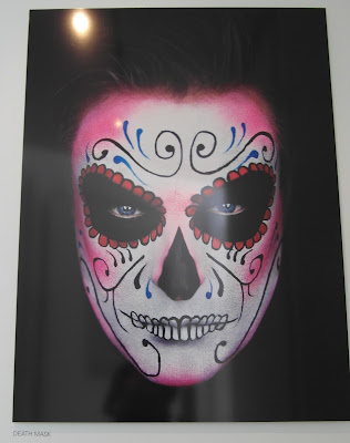
This is a self portrait by Rankin, of a beautiful skull. I find the contrast between the black eyes and white of the face very effective, illustrating the different between the perceived skull, and how beautiful you can make a skull look like.

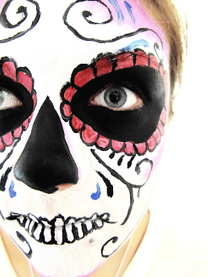
Here I reproduced Rankin's beautiful skull self portrait on my model. I am pleased with the outcome, however some of the details need fine tuning, for example the red petals around the eyes, or the teeth. I feel I have reproduced Rankin's self portrait effectively, with the colours being bold and contrasting well against one another.


Melon dreams

This is one of my favourite images from the shoot, as the model appears to be almost treasuring the melon, making it appear valuable and important. I also like the angle of the right eye, how it's illuminated and very clear.

Canteloupe offerings

This is another photograph from the shoot inspired by Cristina Otero. I tried having the melon in front of the models face, but I feel it still appears too overpowering. though the image appears almost as if the model is offering the melon to somebody, which gives this image character.

Taking inspiration from Cristina Otero's watermelon self portrait

This is one of Cristina Otero's watermelon self portraits. I really like how the watermelon takes the shape of the mouth, and how the red of the watermelon is reflected in the red of the eye shadow. The dots across the nose and over the eyes also reflect the pips in the watermelon, which is something I think works really well.

Here I created my own version of Cristina Otero's watermelon self portrait, using a cantaloupe melon instead. I adopted the pale green with darker green design of the melon, and applied it to the models eyes, as Otero did in her portrait. I added black dots around the eyes t reflect the pips in the melon. I think the melon against the cheek works well, as otherwise it will block out too much of the models face, where it's the eyes that should be the focus point not the melon.


The green mask adopts an apple.

This is a really good photograph from the shoot, as the eye is the main focus of the image, yet you can still see the apple in the mouth to know where the inspiration has come from.

The green mask...

This is possibly one of my favourite images from the shoot, as the eye is looking directly at the camera, rather than off to the distance, making the model appear to connect to the viewer more. The eye is also the closest thing to the camera, making it the focus point, which is something Otero hoes to achieve in all her shots, and I feel I have achieved that in my own shot.

Cristina Otero green fruit inspiration shoot...

This is another of my shots from the Cristina Otero inspired shoot. I really like the angle of this photograph, as the eye looks really big and prominent. I also like how you can see the bottom lip as well as the top, as it creates balance in the photograph. However the green across the eyes does appear a bit patchy in this light, and the background it too white, so the apple doesn't stand out as much as I hoped it would.

Cristina Otero's green fruit...

This is a photographic portrait by Cristina Otero. I really like the vibrant green against the red hair, and how the green section across the model's eyes almost looks like a mask.

Here I replicated Otero's portrait myself, using a more commonly available fruit; the apple. I am pleased with the way it had turned out, as the eyes stand out really boldly, and the dots across the eyes look like pips. However if there was anything I could improve it would be to make the green slightly less dark, but more vibrant, though this isn't something that cant be achieved on Adobe Photoshop.

Wednesday, 24 July 2013

This is a really good image from my photo shoot inspired by Cristina Otero. However when going for the full face shot I should of rounded off the top of the yellow mask instead of leaving it rugged. I am pleased with the eyes as they appear really big and full, and the dots around the eyes help emphasise them more.

I really like the angle of this photograph, how it puts emphasis on the eye making it the focus point of the image. I like how the yellow over the eyes appears almost like a mask and it a very flat, block colour. However I would like the yellow of the lemon to stand out more, so that it doesn't blend into the background so much.

Reproducing Cristina Otero's lemon portrait.

This is a piece of photography by Cristina Otero. I really like how the make up has been done to reflect the fruit in her mouth, a lemon. The eyes are really big and wide, perhaps to suggest the models shock at the sour taste of the lemon.
Here I tried to reproduce Otero's image. I am really pleased with the outcome, especially the way the eyes appear, big and bold. However I do wish the colour of the lemon would stand out more so, but this is something that can be later corrected by Adobe Photoshop.


Pomegranate shoot.

Again this is another of my favourite shot's from my photo shoot. I really like the shape of the lips and the wideness of the eye.

I really like this shot, the model looks really happy, especially with the scrunched up eye.

Shot from Cristina Otero inspired make up shoot.

Experimenting with Cristina Otero's style of photography.


Photographic portrait by Cristina Otero. I really like the mischievous look on the models face, how the dots around the eye form a mask of sorts that reflect the pips in the pomegranate.
Here I tried to replicate Otero's image myself. I am pleased with the outcome, although I think the mouth needs to be more smiling rather than just open, but I think it works very well, looking professional and not dissimilar to Otero's image.


Thursday, 18 July 2013

The Queen or someone like her...

I really like the childlike quality of this piece, how the face appears to be drawn on a separate piece of paper then stuck onto the painting. It's an abstract representation of the Queen, or someone similarly royal.

A portrait of a woman.

I like the technique used to produce this piece at the Walker Gallery. How the woman's image is duplicated several times, heightening her impact. I also like how the artist has used block colours to produce her, there's no messing around with facial features or toning, and the simplicity of it all works very well. I may attempt to use this technique in my own portraits.

Walker Gallery in Liverpool

I visited the Walker Gallery in Liverpool to see Rankin's ALIVE: In the Face of Death photography exhibition.

Personification of pigs at Liverpool Tate

This is a card you could buy from Liverpool Tate gift shop. I think how the pig has been made to appear with human qualities, by giving it a moustache. It adds a humorous quality to it.

Liverpool Tate

I visited Liverpool Tate...I really like the contrasting colours of the orange on the blue, making one another stand out.

Thursday, 11 July 2013

Rankin's photography

This is one of my favourite f Rankin's works. I really like the contrast between the blue sky and the red fabric encapsulating the female model. I also how the model has her arms up in the air in surrender, like she is surrendering herself to nature, completely at bliss. How you can see the exact shape of the models body also makes this piece even more feminine, making it aesthetically appealing.

Rankin's flying woman photography

I really like this piece of photography by Ranking, as the model appears to be floating through air, wit the flowing material behind her adding to the feminine, elegant appearance of the picture. I also like how the woman herself is in silhouette, so all the focus is on her shape, rather than her appearance or how much make up she's wearing, or whether her clothes look right.

Taking inspiration from Rankin's portraits

The design painted on the woman's face is contrasting in itself, with the feminine pink around the cheeks and forehead, then the dominating black eyes rimmed in red semi-circles. I like this piece as she had elements of being both feminine and menacing.

Rankin's colorful face

This piece works really well, and looks softer than all of Rankin's other faces, with colourful splodges painted over the face, leaving spaces where the eyes, mouth and nose are. the photograph taken on a black background also contributes to the face standing out really well, being in contrast to the background.

Rankin's daisy face.

I really like this piece by Rankin, ash has painted a human's face black then stuck daisies on their face. I really like this as it defines the face, and creates a great contrast between the white flowers and the black face.


Initial mind map exploring the concept of "self-portraits"

This is my initial mind map exploring the concept of "self-portraits".

Monday, 8 July 2013

Taking inspiration from Cristina Otero.

The work of Cristina Otero really is spectacular. I hope to take inspiration from her work in my own.

Art Proposal


For my art unit 3 personal investigation I have chosen the starting point of “self-portraits”. I chose this because I think it’ll be really interesting to look at how people present themselves to the world, how other people perceive them, and also how people perceive themselves to look, which could be a completely different way to what other people do.

To complete this investigation I plan to research different methods people use to change their appearance, such as make up and clothing, and research stylists and make-up artists such as Cristina Otero to see how they manage to make the models look a specific way. I will then take inspiration from their work and produce my own experimentations, using their methods.

I will experiment with techniques such as using photography to take photographs of people wearing specific kinds of clothing, looking in a specific kind of way, to show the variations of types of people, and the styles they have. I will also experiment with face paints, painting designs on models faces and them photographing them to capture their image in my sketchbook. From using these images I may try and recreate them using water colours, acrylic paints and maybe even pencil crayon and fine liner, to see which technique works best for me. I may even experiment with mixed media, painting on top of the photographs I have taken to create a different kind of appearance. I may also try combining two or more images, for example take the legs of one image, the body of another, and the head of another, to create a person with three very different types of styles. This will help to show the contrast between all three.
My final outcome as a response to my research may be one main image, being either a photograph that’s been painted into, or even printed on, with several accompanying images in similar styles, or it could be a series of images that all complement one another and show the differences in the way people present themselves.